The recent work on a zine was the catalyses for creating a logo. This is due to having a logo was a requirement for the zine. I wanted the logo have a dark background and white writing. Also, some imagery which is associated with photography such as a aperture ring. I also want to keep the design simple and not over complicate it.
I have researched other photographers logos to draw ideas and inspiration.
Bing images.
As I have articulated, the most simple ideas are the best. To create my logo, I am going to use Adobe Express-as it has a logo, flier function. The first design was one I used on my zine. It used a blue aperture ring on a dark background with a white typeface font. A simple message was conveyed to the viewer was simple, my name and the the companies name.
Researching logos.
According to 5 Tips for Creating a Memorable Logo Design | Design Shack
"The mistake that most designers make when creating a logo is that it contains too much information. To ensure simplicity in the logo design, consider these guidelines:
1 Use no more than four words (or 30 characters).
2 Stick to three or fewer colors.
3 Don’t use more than one design trick or effect.
4 Avoid thin elements for type and artwork"
It is important that your logo is an accurate representation of your company or product. It should have a meaning that’s unique to what you do.
Think about the meaning of colors and shapes when planning the design and how those associations can impact users. (You don’t want to communicate the wrong thing by mistake.) It’s also important to think about the logo in context of your overall industry.
1 Does the logo show what you do or sell?
2 Does the imagery communicate the right thing?
3 Can it stand alone?
The first logo created was used on my zine.
.jpg)
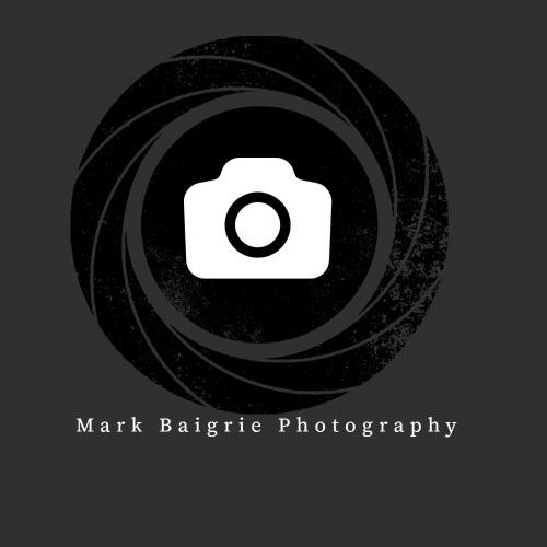
The example above is roughly the ballpark I wish to use for my logo. I added a shape (a camera) to the middle of the aperture ring.and used a different font format.


No comments:
Post a Comment